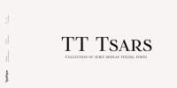
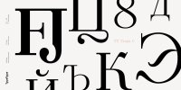
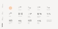
- TT Tsars—a collection of titling fonts
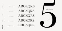
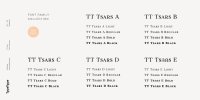
- 20 fonts—5 subfamilies, each of which consists of 4 fonts
- Supports 160 languages (incl. Cyrillic)*
- OpenType features, including Ligatures, Alternate characters**
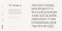
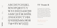
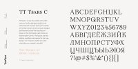
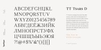
At the very beginning of the project, we had developed a basic universal skeleton for the forms of all characters in all subfamilies of the family, and later on we added styles, visual features, artefacts and other nuances typical of the given period onto the skeleton. Yes, from the historical accuracy point of view it might be that such an approach is not always justified, but we have achieved our goal and as a result we have created perfectly combinable serifs that can be used to style an inscription for a certain time period.
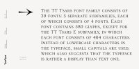
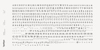
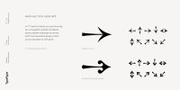
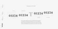
The TT Tsars font family consists of 20 fonts: 5 separate subfamilies, each of which consists of 4 fonts. Each font contains 580 glyphs, except for the TT Tsars E subfamily, in which each font consists of 464 characters. Instead of lowercase characters in the typeface, small capitals are used, which also suggests that the typeface is rather a display than text one. In TT Tsars you can find a large number of ligatures (for Latin and Cyrillic alphabets), arrows and many useful OpenType features, such as: frac, ordn, sinf, sups, numr, dnom, case, onum, tnum, pnum, lnum, salt (ss01), dlig.
Time-related characteristics of the subfamilies are distributed as follows:
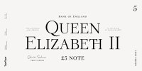
- TT Tsars A—the beginning of the 18th century (Latin and Cyrillic)
- TT Tsars B—the beginning of the 18th century (Latin and Cyrillic)
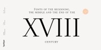
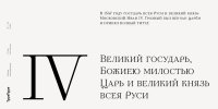
- TT Tsars C—the middle of 18th century (Latin and Cyrillic)
- TT Tsars D—the end of the 18th century (Latin and Cyrillic)
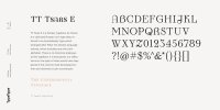
- TT Tsars E—conditionally the beginning of the 18th century (only Latin)
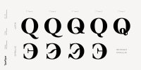
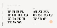
TT Tsars C is now the middle of the 18th century. Cyrillic alphabet itself did not stand still and evolved, and by the middle of the 18th century its forms have changed and become to look the way they are shown in this font family. Latin forms are following the Cyrillic. The figures are also slightly modified and adapted to the type design. In TT Tsars C, Cyrillic and Latin characters are created in parallel. A distinctive feature of the Cyrillic alphabet in TT Tsars C is the residual influence of the flat pen. This is noticeable in such signs as З, Ж, K. The shape of the letters Р, Ц, Щ, Э is very characteristic of the period. In the Latin alphabet, a characteristic leg appears at the letter R. For both languages, there is a typical C characterised by an upper serif and the appearance of large, even somewhat bolding serifs on horizontals (T, E, Г, L).
TT Tsars D is already the end of the 18th century, when with the development of printing, the forms of some Cyrillic characters had changed and turned into new skeletons of letters that we transposed into Latin. The figures were also stylized. In this font, both Cyrillic and Latin are stylistically executed with different serifs and are thus logically separated. The end of the century is characterized by the reduction of decorative elements. Straight, blueprint-like legs of the letters Я, R, K, Ж. Serifs are very pronounced and triangular. E and Э are one-sided on the middle horizontal line. A very characteristic C with two serifs appears in the Latin alphabet.
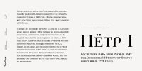
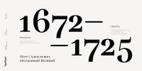
TT Tsars E is a steampunk fantasy typeface, its theme is a Latinized Russian Сivil type (also referred to as Grazhdansky type which emerged after Peter the Great’s language reform), which includes only the Latin alphabet. There is no historical analogue to this typeface, it is exclusively our reflections on the topic of what would have happened if the civil font had developed further and received a Latin counterpart. We imagined such a situation in which the civil type was exported to Europe and began to live its own life.
To view the link, you must: Sign In
Font - TT Tsars.
Format: OTF
Size: 1.7 Mb
-
 preview-01.jpg
 -
 preview-02.jpg
 -
 preview-03.jpg
 -
 preview-04.jpg
 -
 preview-05.jpg
 -
 preview-06.jpg
 -
 preview-07.jpg
 -
 preview-08.jpg
 -
 preview-09.jpg
 -
 preview-10.jpg
 -
 preview-11.jpg
 -
 preview-12.jpg
 -
 preview-13.jpg
 -
 preview-14.jpg
 -
 preview-15.jpg
 -
 preview-16.jpg
 -
 preview-17.jpg
 -
 preview-18.jpg
 -
 preview-19.jpg
 -
 preview-20.jpg
 -
 preview-21.jpg
 -
 preview-22.jpg
 -
 preview-23.jpg
 -
 preview-24.jpg
 -
 preview-25.jpg
 -
 preview-26.jpg
 -
 preview-27.jpg
 -
 preview-28.jpg
 -
 preview-29.jpg