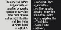
Francesco Canovaro was inspired for the design of Quenta by the discovery of the handlettered masthead of Queenslander, a weekly magazine of news related to "society, sport, literature, theater and rural life", published in Queensland, Australia, during the first half of XIX century.
The condensed serif letterforms of the magazine title, embellished by a highlight effect, had been complemented by a vibrant cursive script. It was an eye catching combination typical of the so called "showcard" lettering style, widely used in advertising during the first half of last century. Looking for the same vintage vibes, Francesco's research moved to the books by penmasters like Ross F. George or Samuel Weld. In their showcard manuals, he found a peculiar ambiguity in the letterform treatments, halfway between calligraphic execution and contour drawing.
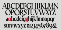
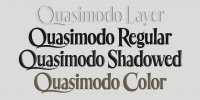
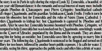
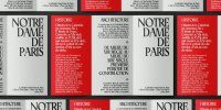
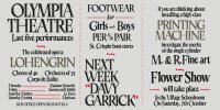
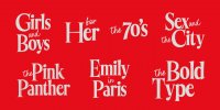
This warm, human touch and the historical references gave the condensed shapes of Quenta a lively personality and a literary charme. To match a design so rich in vintage storytelling, Francesco choose for the typeface a name that comes from the writings of one of the master world-builders of the last century. "Quenta" is the Elven word for "story" used by J.R.R. Tolkien in the Silmarillion. To let you experiment with his vintage decorative layers, Quenta comes in five styles and different color font formats. It also includes Discretionary ligatures to allow you to use script elements to enrich its expressive range for editorial and logo design.
To view the link, you must: Sign In
Font - Quenta.
Format: OTF
Size: 0.3 Mb


