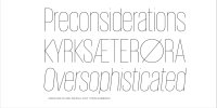
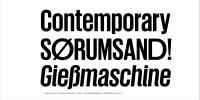
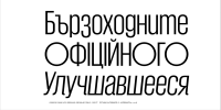
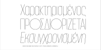
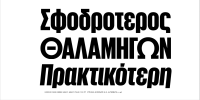
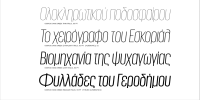
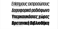
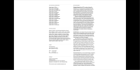
Giorgio and its matching sans serif were originally designed in 2007 and 2008 for Chris Martinez, the art director at T, The New York Times Style Magazine, with the idea of bringing runway proportions, and the graphic style of the 1920s & ’30s to the page.
Giorgio has been drawn in four optical sizes, to avoid the compromises demanded by its extreme contrast between thick & thin. With a single optical size, it would have been necessary to reduce the contrast or limit its use to 150 point, or more. The wide variety of alternate characters make Giorgio an inspired choice both for headlines and logotypes.
Giorgio takes many of its cues from Imre Reiner’s late 1930s typeface Corvinus, but its mix of extremely high contrast, hard geometry, & strange, pretty details give it a distinctive character of its own, and an extensive set of alternates gives the face additional flexibility for fine-tuning a logotype or headline.
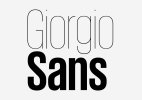
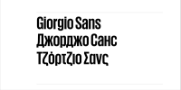
Rather than drawing from the high-fashion Art Deco influences seen in the serif, Giorgio Sans was inspired by more everyday sources such as French enamel signs & generic straight-sided American sign lettering from the early 20th century.
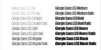
The extreme x-height helps to differentiate Giorgio Sans from other straight-sided sans serifs; this and the straight-sided bowls connect the sans back to its serif companion. In addition to the structural & proportional similarities, some of the distinctive details from Giorgio were brought into Gioriog Sans in order to allow the two faces to be mixed in interesting ways. One example is the alternate italic lowercase with more traditional cursive tails, echoing the more extreme tails in the serif.
To view the link, you must: Sign In
Font - Giorgio Sans.
Format: OTF
Size: 2.7 Mb

