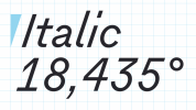
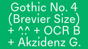
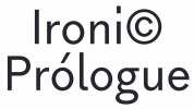
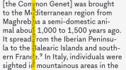
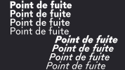
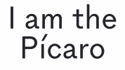
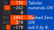
Gineto is a clean and airy contemporary grotesque, tailored for small sizes. The design concept developed from the brevier size of Gothic no. 4, a nineteen century design by the New York type foundry Farmer, Little & Co.. This brevier features slightly narrow shapes with generous letter-spacing and long ascenders and descenders.
Although expected in a cut for small sizes, these features are charmingly striking in Gothic no. 4, specially with the elongate dot of the i, that aligns at ascender height.
Gineto’s design echoes the spacious and ventilated construction of Gothic no.4, letting the white come through abundantly, and avoiding closed letter-forms, that in grotesques often generate confusion, like the 6 or 3. We also gave each letter the most unambiguous shape, and the most spread out configuration.
In the process of fashioning Gineto there were ideas drawn in from Adrian Frutiger’s OCR B, a typeface designed to be machine-readable but also pleasant to the human eye. Gineto was also infused with a little bit of Akzidenz Grotesk feel to bring its overall look a bit closer to the European sans serifs tradition.
To view the link, you must: Sign In
Font - Gineto.
Format: OTF
Size: 0.7 Mb


