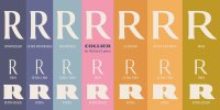
Collier occupies a magical space between serif and sans serif, combining the best of both worlds. Because of its balanced proportions and moderate contrast, as well as the lack of intricate details in its letterforms, it doesn’t need optical sizes. The tapered finials and flared serifs look refined in display settings. Those serifs ground the characters, creating a comfortable text flow, while the open apertures keep Collier readable in text sizes. It can be deployed in editorial design, in identity design and branding, for corporate use, in packaging—the applications for the family are virtually limitless.
Collier’s final tally is twelve weights in seven widths, all in roman and Italic, adding up to a total of 168 styles. This impressive breadth offers a great deal of flexibility for users who can’t yet access the infinite instances that a variable font will be able to generate once this technology is fully accepted and commercially viable. Collier is the perfect antidote for all-purpose families that lack personality. If you’re on the hunt for a versatile family that is not only elegant and reliable, but also covers a wide range of weights and widths, take Collier for a spin.
To view the link, you must: Sign In
Font - Collier.
Format: OTF
Size: 14.7 Mb


