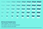
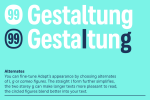
We were thinking of you, the designers, when we created Adapt — because you love convenience. Our most versatile sans serif lets you fit your text into any space giving it a neat and confident appearance.
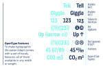
Adapt spans five widths from Normal to Compressed and eight weights from Thin to Black plus lots of handy extras. An overall flexible playground for typographic expression with a total of 80 fonts to choose from. Even more choice comes with Adapt’s 2 variable fonts, Adapt Var Roman and Italic, that allow for a seamless navigation within the design parameters of width and weight. The usual styles can be chosen at any time as well.
The nitty-gritty.
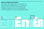
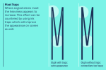
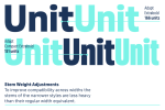
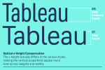
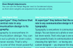
It takes a lot of planning to create an extensive font family. Nothing is quite what it seems when it comes to widths and weights in typeface design, and what is mathematically identical is often visually different. For this reason, the x-height of a Bold must be significantly higher than in the Regular in order to appear the same height as the latter. Also, when designing a Condensed version, its Bold stems should be slimmer than the normal Bold to maintain the overall gray value of text. The overshoot in the Compressed styles need tweaking as well, in order to harmonise the cap and x-heights across widths. Finally, ink traps keep the letters' inner forms open in condensed styles, even when working in pixels and are indispensable for good screen rendering. All of these principles are essential when creating a well-functioning, harmonious typeface family.
A good look.
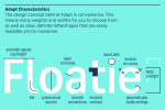
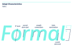
Adapt combines adaptability with a crisp no-nonsense look. Tension on the curves, l with a tail, open terminals and low contrast define its appearance. A large x-height, and optional two storey g also contribute to its legibility, even feasibly so when compressed. Adapt is our most versatile sans serif typeface yet.
To view the link, you must: Sign In
Font - Adapt.
Format: OTF
Size: 4.5 Mb

